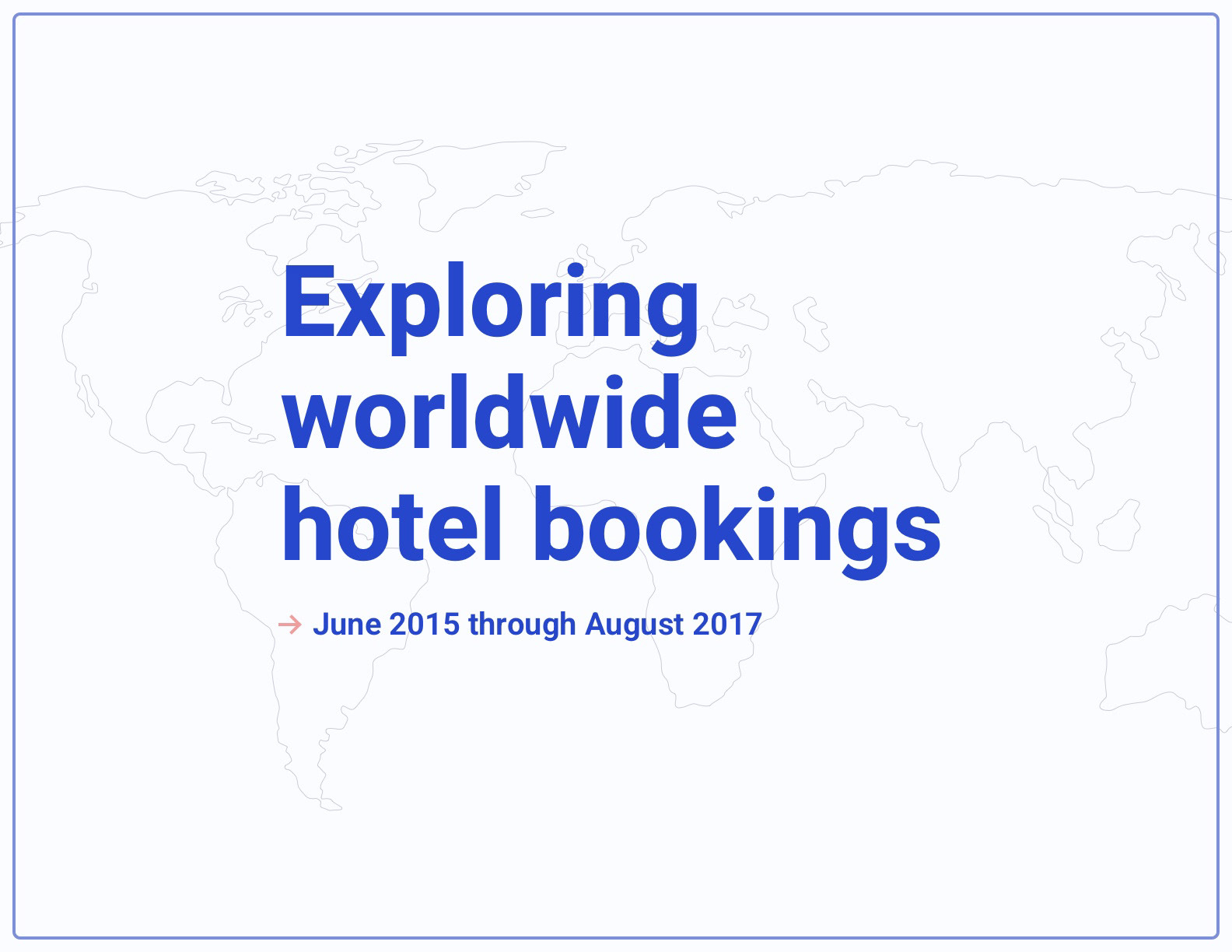
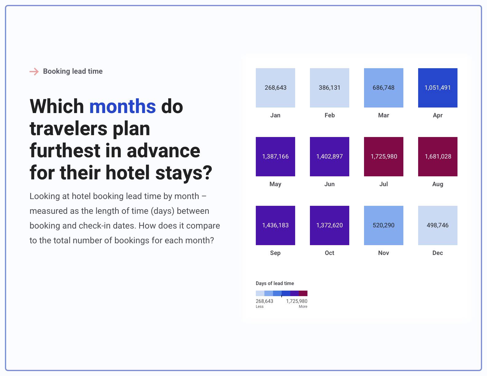
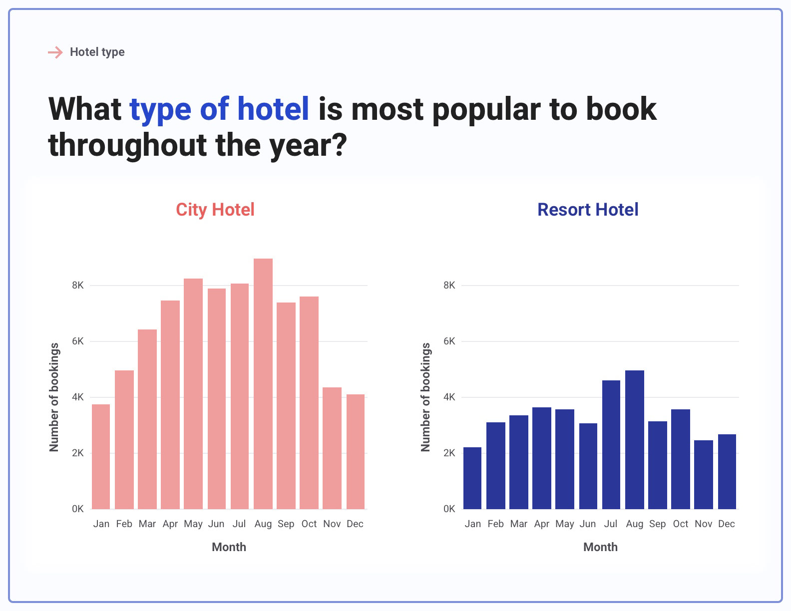
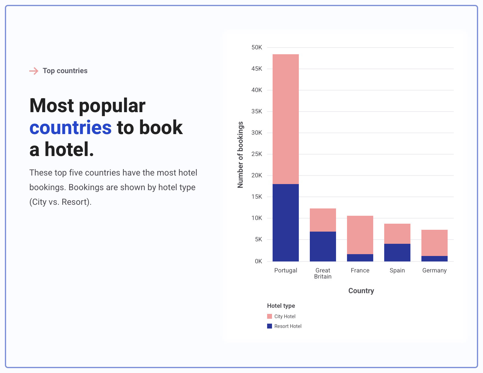
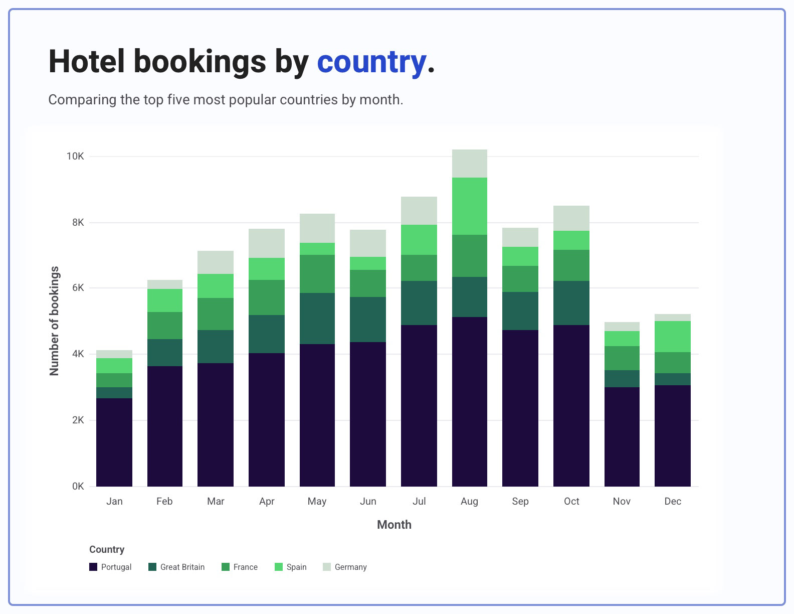
A data visualization on worldwide hotel booking trends, created for a course I took from The New School. The goal was to explore and display the relationships between hotel booking rates and a number of factors, including: time of the year, hotel type, and country.
Data source: "Hotel booking demand datasets" by Nuno Antonio, Ana de Almeida, Luis Nunes
Tools: Tableau, Sketch
Process
Finding a dataset and conducting initial research.
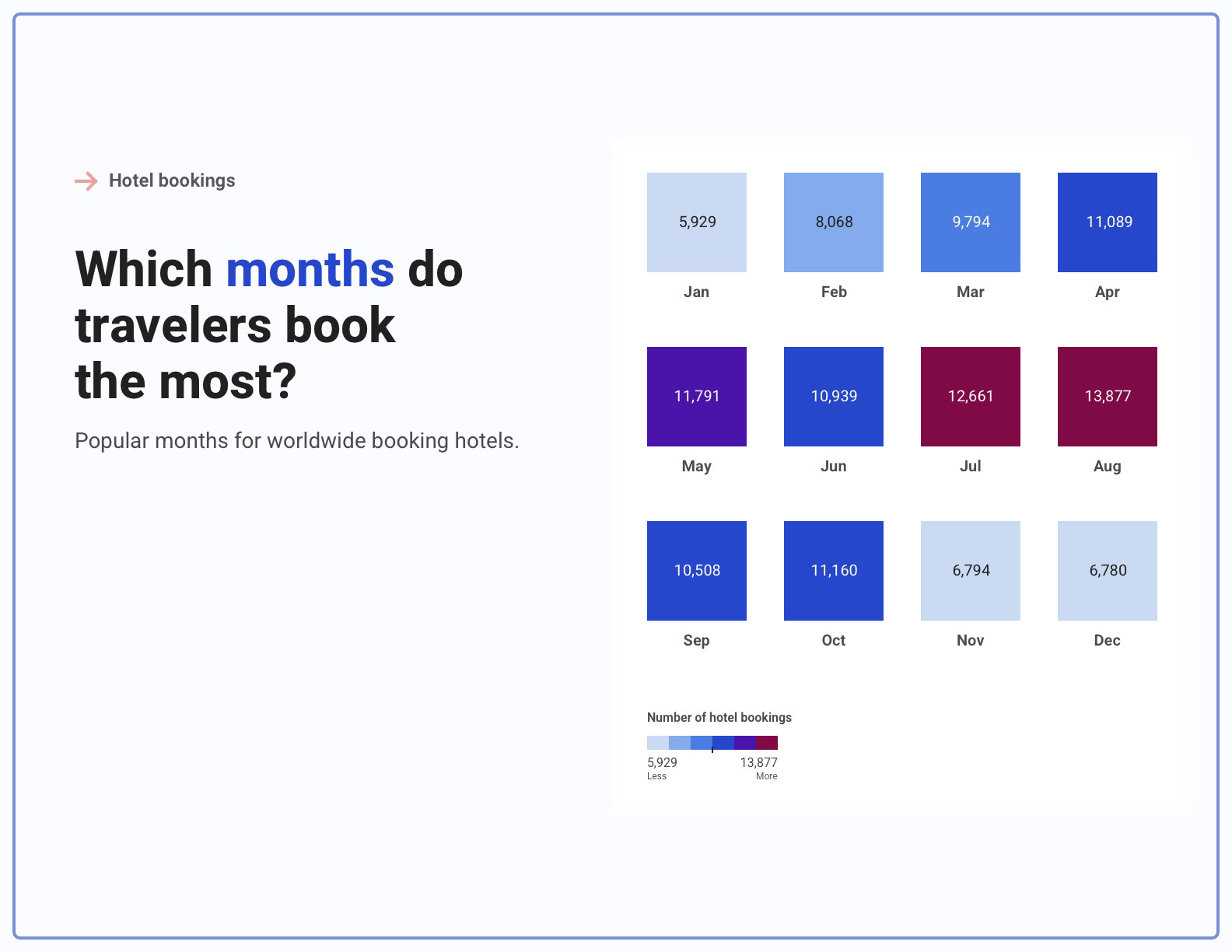
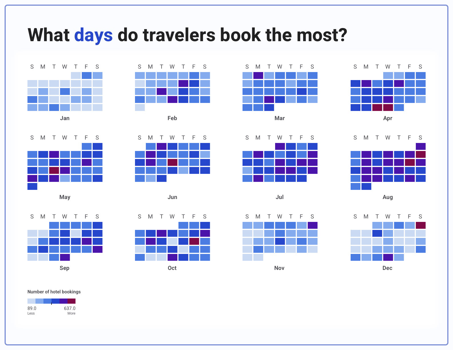
I browsed the Kaggle website for a dataset to base my visualization on and found a dataset on hotel booking demand (data taken from June 2015 through August 2017). I uploaded and explored the dataset in a Tableau data story to identify key characteristics, trends, and relationships. I also gathered interaction and data visualization inspiration from sites such as Tableau Public Gallery and The Pudding.
I browsed the Kaggle website for a dataset to base my visualization on and found a dataset on hotel booking demand (data taken from June 2015 through August 2017). I uploaded and explored the dataset in a Tableau data story to identify key characteristics, trends, and relationships. I also gathered interaction and data visualization inspiration from sites such as Tableau Public Gallery and The Pudding.
Creating a design system.
I determined design guidelines for the data visualization, including color palettes and typography for headings, axes, and grids. The design system color palettes were constructed using a color blindness simulator and a color contrast checker, so the visualization can be understood by those with visual impairments.
I determined design guidelines for the data visualization, including color palettes and typography for headings, axes, and grids. The design system color palettes were constructed using a color blindness simulator and a color contrast checker, so the visualization can be understood by those with visual impairments.
Sketching and storyboarding.
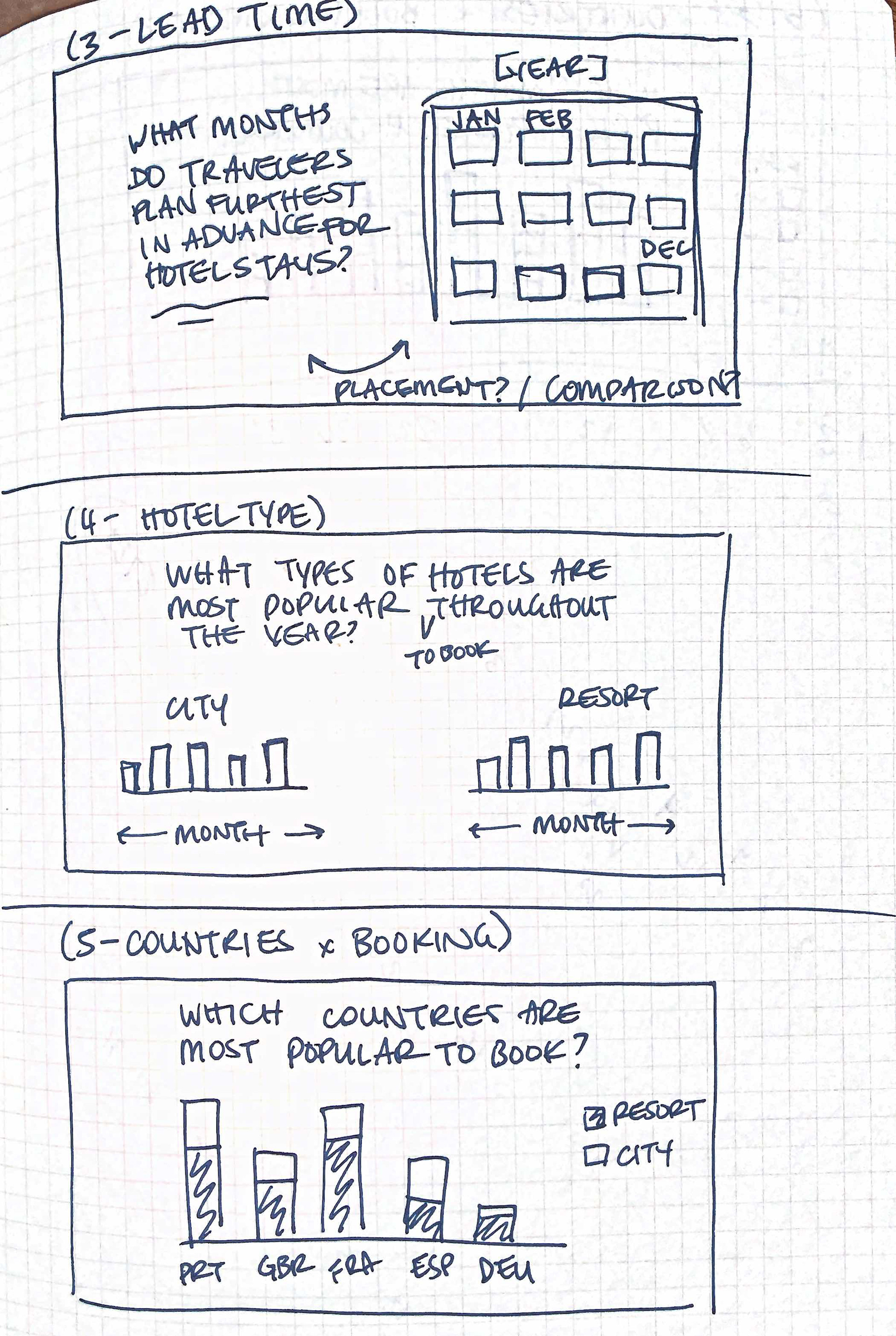
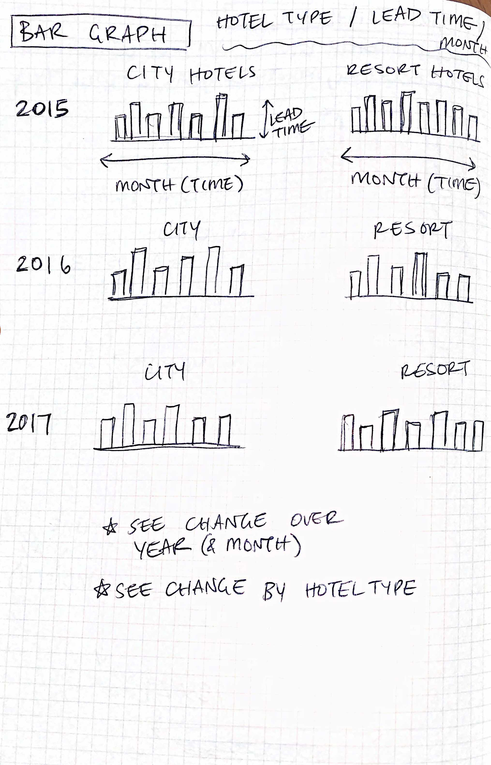
After determining the design guidelines and visuals, I brainstormed and sketched multiple options for the final data visualization. I wanted to explore different styles of graphs and visualizations to see which most effectively told the data story and displayed the insights. Through these sketches, I determined a final direction and drew a storyboard outlining the different pages and flow of the final visualization.
After determining the design guidelines and visuals, I brainstormed and sketched multiple options for the final data visualization. I wanted to explore different styles of graphs and visualizations to see which most effectively told the data story and displayed the insights. Through these sketches, I determined a final direction and drew a storyboard outlining the different pages and flow of the final visualization.
Constructing the final data visualization.
I modified my data story in Tableau to match the flow and graphs outlined in my storyboard sketch. Using the Tableau story as a basis, I then created the final layout and high-fidelity visuals in Sketch in order to properly implement my design system guidelines.
I modified my data story in Tableau to match the flow and graphs outlined in my storyboard sketch. Using the Tableau story as a basis, I then created the final layout and high-fidelity visuals in Sketch in order to properly implement my design system guidelines.
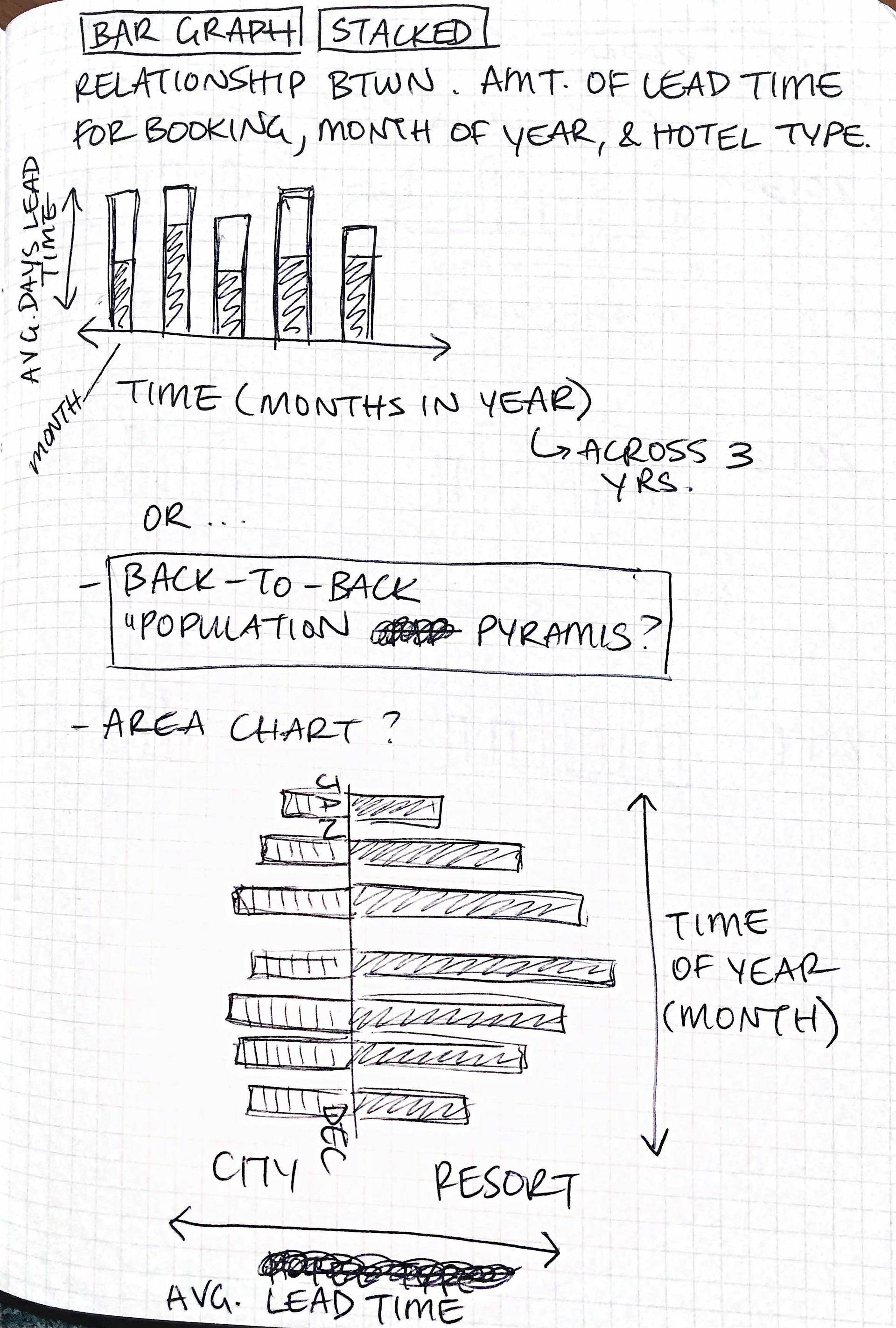
Bar graph brainstorm
Small multiples brainstorm
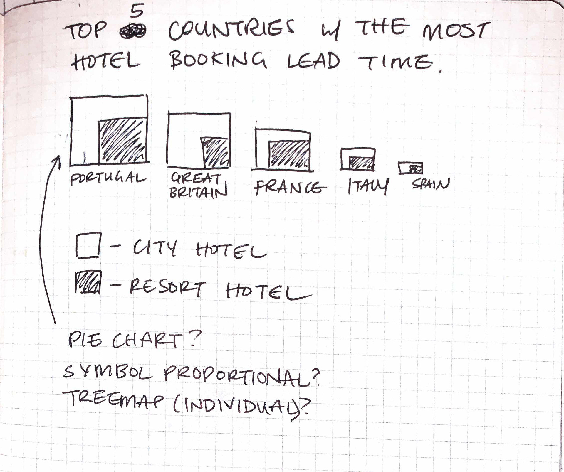
Symbol proportion brainstorm
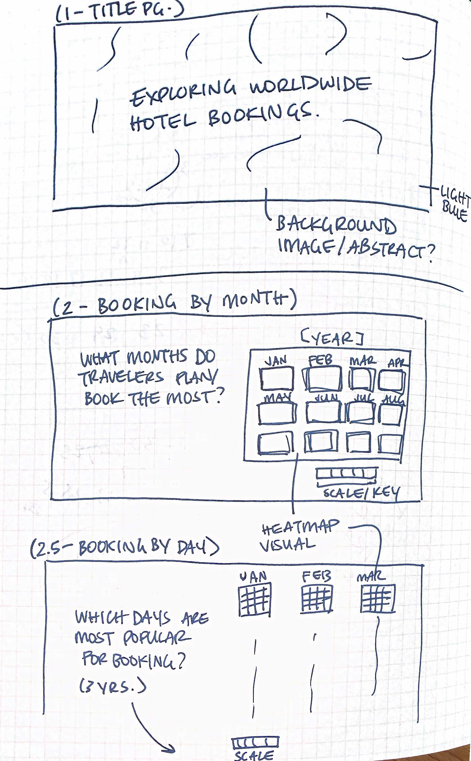
Storyboard sketch